Today we’ll talk about Throughput metric. Why is it so important, how to read it’s patterns and what to be cautious about.
Premise
Imagine walking into a bar on a Friday evening, exhausted, and ordering a beer flight. The bartender thinks:
“Over the past hour we completed 12 orders; there are 4 in progress; this will be the fifth. Your flight will arrive in 20–25 minutes.”
There are no subjective complexity estimates – only historical data to forecast wait time. Wouldn’t it be great if an IT team could plan as simply, honestly, and predictably? Ha-ha, you wish
What Is Throughput and Why It Matters
Throughput is the number of items completed per unit of time. If a team closes eight work items in one week, throughput = 8 items/week. Objective, simple, and tamperable if required (of course you can hack any metric).
Super simplified example, 15 user stories completed in two weeks → throughput = 7.5 stories/week.
Throughput by Bi-weekly intervals (not necessarily sprints). Looks rather steady.
Other key flow metrics include Cycle Time, WIP.
Three Views on Throughput Analysis
1. Time Granularity
Choosing the right period is crucial for meaningful analysis. Relying on sprint-level velocity yields only ~26 data points per year. This is for two-week sprints. This amount is barely enough for basic trend detection.
On weekly periods the Throughput looks slightly different
Weekly measurements: ~52 data points/year—captures broader trends
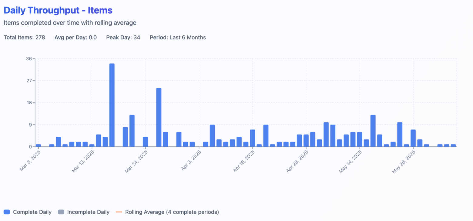
Daily measurements: ~260 data points/year—reveals weekday patterns
Dynamics show that at the very peak days team just closed many items. And all of a sudden it didn’t have any flat periods in may (during golden week)
Example of weekly patterns:
Monday: 0 items (planning)
Tuesday: 1 item (ramp-up)
Wednesday: 3 items (peak)
Thursday: 2 items (reviews)
Friday: 2 items (releases)
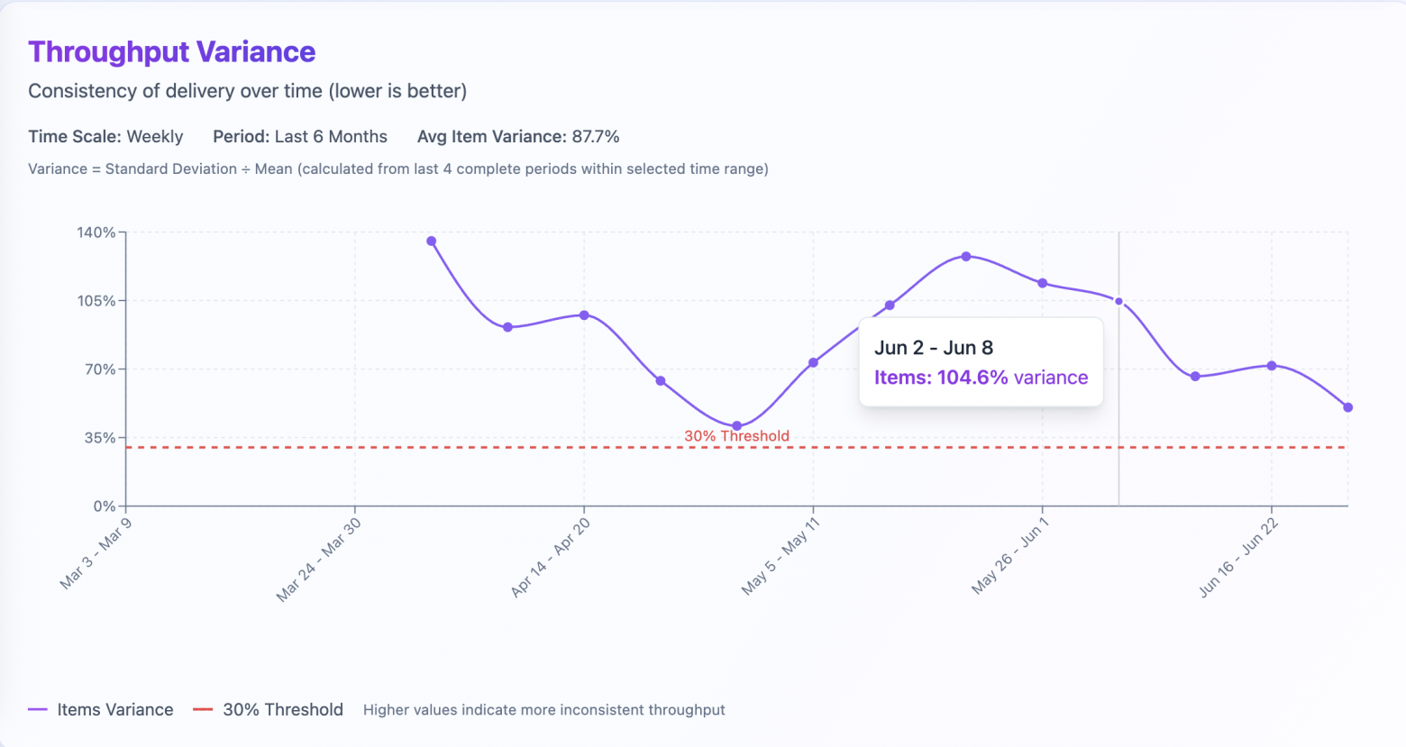
2. Variability: A Stability Indicator
Variance example on week of june 2-8. Team is doing +-104% of work from the previous sliding window of 4 previous periods.
Forecasts require stable throughput. The coefficient of variation quantifies this:
Coefficient of Variation = (Standard Deviation / Mean) × 100%
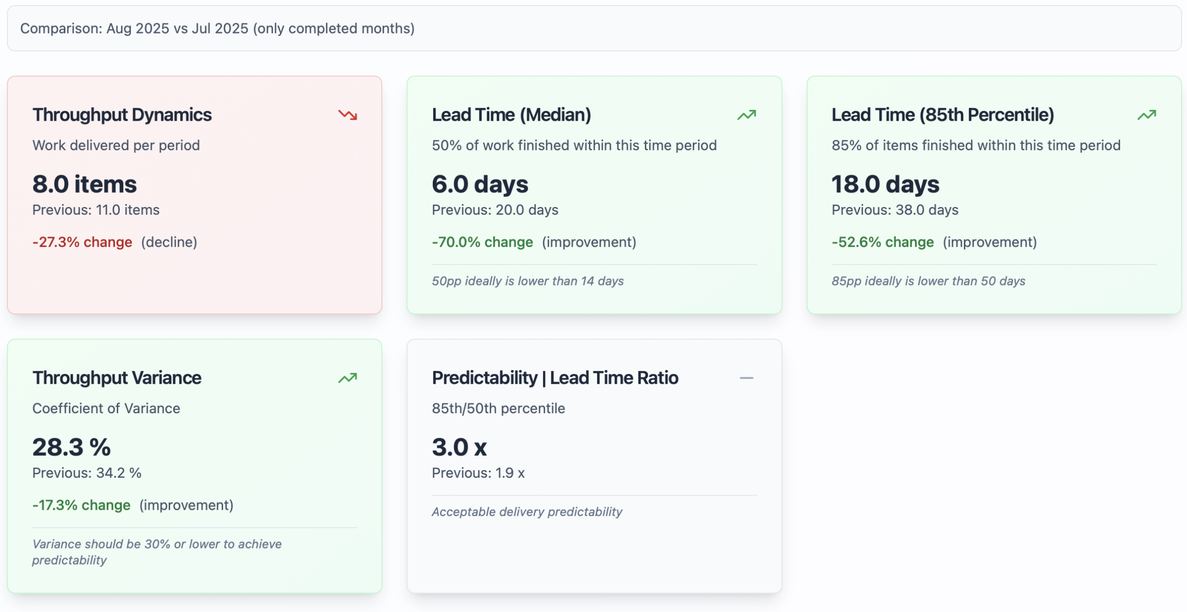
Keep in mind that smart people (Mr. Vacanti) state, that Throughput data may not be normally distributed. In such cases, the mean might not be reliable. It is sensitive to outliers and skewness. Percentiles, such as the median (50th percentile), are often more robust. The 85th percentile provides better insight into values distribution. They are unaffected by outliers. They can offer a clearer picture of system performance. This makes them more practical for understanding behavior under varying conditions. Therefore, using percentiles is often more informative for non-normally distributed data.
an example in visualizing percentiles. We can see that on week 27/07/2025-02/08/2025 team’s delivered 2.5-5.1 items which is in many cases enough to forecast more realistically than in simple average number
3. Work Type Distribution
Different work types affect throughput. Completing 4–5 large user stories versus 10–15 small bug fixes yields different counts. Analyze throughput by work category to understand these effects.
In greenfield projects, before the MVP, the team might gain some throughput of 10-15 items per week. Right before the release, they may have 20-25 items. Most of these are bugs. Throughput is higher, but at what cost? There is less value and more fixing.
Team started new phase of their product in Q2. Number of research items (spikes) and stories increased. No. of tech tasks and defects on the other hand decreased.
Excellent numeric stability doesn’t guarantee the right outcomes. And vice versa: stable throughput is not necessarily a pattern of a healthy team.
Throughput is a starting point; balance it with WIP limits, Cycle Time, and qualitative indicators like system reliability.
And here we come to Little’s Law, which binds it together.
Little’s Law: The Flow Theorem
Flow metrics are interrelated.
Little’s Law formalizes this:
Lead Time = WIP / Throughput
WIP: work in progress
Throughput: completed items per period
Lead Time: time from commitment to delivery
This only holds with enforced WIP limits. Without limits, the system becomes chaotic, invalidating forecasts. Please start with at least your current numbers or review how to set up WIP Limits at getNave.
Why Story Points Fall Short
Ok, let’s finally address the elephant in the room! Why the hell do we need the Throughput if we have Story Points?
The thing is: Story Points don’t really correlate with the Lead Time. This is the time it took for an item to be completed starting from the commitment point. That means that 5 SP often is finished within the time required for 2 SP. And items estimated in 8 SP are inconsistent when we look at the absolute time it took to finish them.
The cherry on top is Vasco Duarte’s (NoEstimates book) experiment. He basically asked “What will happen with forecasts, if we remove Story Points out of the work items? What will happen, if all of those twos, threes, fives, eights and thirteens would be converted to ones?”. Forecasts with Story Points deviated 20% from the final result. Forecasts based on Throughput (Issue Count) deviated only 4%!
The main idea is simple. Forecasting based on the number of work items finished gives the same or better result. It requires less effort!
In my experience in large Fintech and Digital organizations, Story Points are used by around 50-60% of teams. This is also true in smaller startups. Moreover, all of those teams are using them differently from their original intent. Dedicated Scrum Master or Agile Coach roles could prevent this. But these roles are extremely costly.
Visualization Tools
Jira Metrics Plugin: This Chrome extension provides real-time flow metrics. It hooks up to your Jira in one click. It is safe and secure to use within enterprises.
Predictable Team: my own Jira/ Youtrack/ Freeflow CSV analyzer with basic flow metrics visualization, recommendation system and Monte Carlo simulator for forecasting
Team summary instrument at predictable.team – compare your team’s performance within time periods to support data-driven result authorisation and decision making.
Thanks for reading and i hope that was helpful! Cheers mates.


One thought on “3 key data slices to understand your team’s Predictability through Throughput (pun intended).”